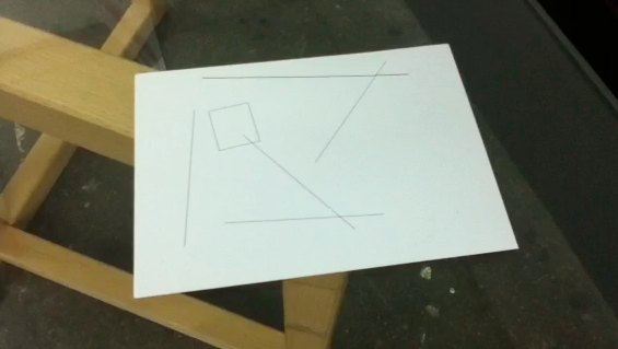
On Tue 15 May we attended a talk at Spike by artist and designer Daniel Eatock. He designed a postcard for the current exhibition – a copy of which visitors can take away. I had thought it was simply a minimal, abstract composition – similar to a Malevich, or Moholy-Nagy. But in the talk he showed another variation; the composition was actually made up of the graphic elements found on the back (written) side of a postcard – the line down the centre, little box for the stamp, lines on which to write an address. He had had a friend write an algorithm to randomise their placement.
This made perfect sense in the context of his other work, which was about process and had a kind of ‘circular logic’ as he described it. A frame with the same dimensions as the display area; a spray can painted with its own paint; a piece of paper with instructions printed at an angle – instructions to pin it to the wall such that the text was level.
At the start of the talk he handed a digital camera to the audience, instructing each person to photograph the person next to them then pass it on. This, he explained, was a way of transferring his nervousness over to the audience.
It also was similar to what we were doing at Spike – using computational tools and thinking to focus on processes, operations, instructions. What Eatock demonstrated was that every act, every process could result in an artwork.
I had also done something for the postcards exhibition – prompted a collaboration between artists and a writer through technology. After his talk I asked Eatock whether he would be open to handing over the postcards he designed to other artists for them to adapt for an emergent work. But he had a better idea: ask people to fill it in, write or draw something, and then address it – jumbled lines and all – to Spike Island.
We’ll see how/whether the Post Office likes that.
(Info on Postcards 1.0 is here)


